Dracula: A Symphony in Moonlight & Nightmares, by Jon J. Muth (1993) E

Reviewer: Emera
Date read: 1.5.2019
Book from: Personal collection

Jon J. Muth’s graphic-novel retelling of Dracula is delicate, foreboding, and ravishingly lovely – if slightly unconvincing from a narrative perspective; luckily the written narrative is almost beside the point when the art is this lovely. I ride or die for watercolors, and had to locate a copy of this out-of-print volume after seeing Muth’s watercolor illustrations for it online: sheer lavender shadows, chill expanses of castle stone, translucently pale flesh, and an overall air of elegant, sensual hush and expectancy.

Honestly, I think it’s a shame that he decided to do the cover of the novel in oils (though I understand that watercolors often don’t hold up as dramatic cover art) since it looks that much more generic, in addition to that particular illustration aesthetically betraying the work’s 90s vintage. (There are also a couple of interior illustrations where the women have seriously 90s hair, which makes me smile, but undermines what I otherwise feel to be a timeless style.)

Narratively, this is what I’d call a slightly transposed Dracula, where characters’ identities are swapped or merged, so that ultimately the focus rests even more firmly on the experience of the female protagonists. Here, Mina is the red-headed, morbid hysteric/consumptive, while Lucy is the grave and dark one. Both are subtly at odds with the masculine society around them, here represented by a conglomeration of most of the sympathetic male cast of Dracula into a few paternal[istic] figures. With this choice, Muth removes the Bachelorette sideshow of Mina’s courtship, foregrounding instead the telos of Dracula, Lucy, and Mina.

Continue reading Dracula: A Symphony in Moonlight & Nightmares, by Jon J. Muth (1993) E

Flesh and Bone, by Julia Gfrörer (2013) E

Reviewer: Emera
Date read: 6.16.2017
Book from: Gift from K. (<3)

Flesh and Blood is Julia Gfrörer’s first published comic, and my second-favorite of the three I’ve read, after Black is the Color. Grim, wry, blood-and-hemlock-flavored, this is highly recommended for lovers of Robert Eggers’ film The Witch.

This is so narratively satisfying, all the symmetry and the sinewy Machiavellian strength of the witch’s plotting. She’s a dark free agent, pulling snare-cords neat and tight around convenient prey. She’s not quite so dispassionate a predator as the mermaids in Black is the Color, though. Displaced romantic and erotic desire teases the otherwise calm, chilly surface of her calculations. This culminates in an uncomfortably powerful erotic scene involving a mandrake. Period.

The displacement of desire and passion – longing for what’s not close to hand, fulfillment through proxies – creates a weird kind of momentum throughout Flesh and Bone. I imagine water continually spilling from unstable vessel to vessel, never at rest, and shared between vessels only in passing.

Like all of Gfrörer’s work that I’ve read, the comic is also an inhabitation of the experience of grief – grief that is more than sorrow, grief that wrings to the bone. This grief that strains the limits of human capability – and the teasing touches of hopeful sweetness, as expressed through longing and eroticism – all that mixed together, in one brief comic, it’s exquisite, and sublime.

Gfrörer’s work is an uncommonly raw expression of the intensity of existence. It goes deep, deep, deep, like almost nothing I’ve read or seen before, except (as I said before) Ingmar Bergman’s The Seventh Seal. There is nothing precious, or half-way, or untrue about her work. I think she’s a visionary not in the sense of seeing something beyond – I think she looks at human existence and sees in.

Related reading:

Laid Waste, by Julia Gfrörer (2016): review by Emera


If you’ve enjoyed our posts, consider contributing a dollar or two to help support our blog.

Laid Waste, by Julia Gfrörer (2016) E

Reviewer: Emera
Date read: 6.14.2017
Book from: Gift from K. – THANK YOU!

So fucking dark and anguished. Julia Gfrörer’s Laid Waste is a desperate song about human love amid plague-stricken Europe – like a graphic novel cousin of Ingmar Bergman’s The Seventh Seal. Grasping, bony fingers and limp corpses.

Gfrörer intercuts long passages of the deepest existential despair with wisps of dark humor – two children flatly discussing how best to avoid breathing in the smoke from a bonfire, for example – and with the fragile suggestion of divine grace. Better, though, than the questionable blessing of unlooked-for survival, is the desperate strength of human connection: “Everything outside of this is darkness.” “Yes.”

I don’t know that I’ve ever felt so deeply, with both mind and body, the vast loneliness and despair of one of history’s darkest periods – and humanity’s baffling, tragicomically stubborn resilience in the face of unrelenting loss.

Like her storytelling, Gfrörer’s art feels both delicate and terrifyingly honest. It establishes a territory somewhere between Dürer and Egon Schiele. Meticulous hatching contrasts with wavering, slightly uncomfortably organic shapes. That wavering quality creates a strange sense of movement even when she’s working through one of a series of mostly stationary panels, which compel us to wait and watch and feel with her characters. With most other artists, the inconsistency of shape and anatomy would register as a technical shortcoming; with Gfrörer, it’s another means of expression.

I feel very, very lucky to have been introduced to Gfrörer’s work through a generous gift from friend K.; I plan to write about the two other comics he gifted me, Black is the Color and Flesh and Bone, over the next few weeks, and hope to buy the rest of her comics soon.

Go to:
FLOOD Magazine: Sex, death and suffering – a conversation with Julia Gfrörer, author of Laid Waste

Wet Moon vols. 1 and 2, by Sophie Campbell (2004) E

Reviewer: Emera
Date read: Nov. 2016

I’ve enjoyed the work of Sophie Campbell (formerly Ross Campbell) for 12, 13 years maybe. In high school I spent hours poring over the endless portraits (almost exclusively Wet Moon characters, at the time) in her deviantART account – humid, sexy, angsty, a little uncomfortable, very Goth, all executed in her trademark style of mostly monochrome ink and marker, with lots of lovely wash textures. There was a lot going on that you didn’t see much of in comic art those days – chubby girls, black girls. I was fascinated almost equally by the bodies and the fashion – hair, piercings, soft thighs under ripped fishnets – of all those languorously sprawling, sulkily self-possessed, implicitly vulnerable girls (and very occasional androgynous boys).

I have no good reason for why it took me so long to actually read Wet Moon, except that it used to be harder to find comics from smaller labels.

In the time since, Campbell came out as trans. To put it baldly, this presented an easy resolution to my one discomfort with Campbell’s work: that it could come off as voyeuristic, or fetishistic. To have a lingering male gaze suddenly revealed as [trans]female – suddenly consumption, desire, appreciation, longing are all construed so, so differently. Finding out that Campbell had come out as trans remains the most interesting shift I’ve ever experienced in my perception of an artist and their relationship to their work.

Wet Moon is a dark, dreamy slice-of-life comic, featuring a cast of southern, small-town punks, Goths, and art students, almost exclusively women, and heavily queer. Flavors: cigarettes, hairdye, patchouli, art-supply-store air, pie, swampwater. I’ve also seen comparisons to Twin Peaks, though being only two volumes in, the implied supernatural/mystery element is very slight. There’s a missing student who left a strange dark circular stain on her apartment floor, for example, and inexplicable, moonstruck behavior performed by various characters – midnight swamp immersions, ritualistic circling in front of windows. It’s all lovely and unsettling, and reminds me of, yes, the earliest episodes of Twin Peaks, where I had no idea what was going on, and small moments were rendered all the more terrifying because of it. (Those shots of the traffic light at night, for example – I don’t think I’ve ever been more afraid of what a traffic light might mean.)

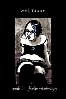
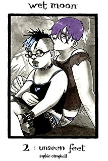
The protagonist is Cleo Lovedrop (yes, all of the characters have wonderful, absurd names – Malady Mayapple might be the winner), with the blue forelock on both of the covers above. Her struggles with romantic confusion and low self-esteem have so far provided the most obvious or continuous dramatic impetus for the series. But the drama is deliberately minimal; the interest lies more in mood, in the understated sense of mystery, and in the affectionate evocation of the banter – listless, playful, or barbed – and small upsets within an extended network of friends.

And then, much of the series so far has been implicitly about bodies: resenting them, costuming them, wanting them to be something different, subjecting them to long minutes of mute observation and appreciation. Multiple characters receive scenes of self-examination in mirrors: sucking in stomachs, examining scars, trying to make muscles. Most of the characters are overweight; some have disabilities or deformities. There’s so much bodily difference that different becomes the order of the day. The cumulative effect is, again, lovely; all the soft curves and folds and rumpled, revealing clothing contribute their own sense of soft melancholy.

Wet Moon is a unique and soulful work of art; I’m grateful that it exists. Scuttlebutt suggests that the series does become plottier, or at least more overtly dramatic – as a devoted fan of plotlessness, I’m almost disappointed, but obviously excited too for whatever Gothic mayhem awaits. Now it’s on me to track down the remaining four volumes (hopefully in the updated editions, with Campbell credited as Sophie, and some great cover designs by Annie Mok); volume 7 is still being eagerly awaited.

Related reading:
Wolf in White Van, by John Darnielle (2014) E

Rat Queens, vols. 1-2, by Kurtis Wiebe, Roc Upchurch, Stjepan Sejic (2014-5) E

Reviewer: Emera
Date read: 10.2016
Book from: Library


book-ratqueens-violet

Rat Queens is a rambunctious Dungeons ‘n’ Dragons parody featuring a gang of ultraviolent, foul-mouthed lady adventurers: Hannah the moody, uptight elven mage, dwarven warrior Violet (pictured above with her orc boyfriend Dave), escaped-from-a-Lovecraftian-cult cleric Dee, and candy/hallucinogen-obsessed smidgen (i.e., halfling) Betty. In Volume 1, the Queens deal with the consequences of their inability to rein in their penchant for destructive brawling, which has earned them enemies within the walls of their own town. In volume 2, the airing of old grudges escalates to the summoning of Lovecraftian beasties; the ensuing ruin is intercut with flashbacks that begin revealing the younger lives of most of the Queens.

Rat Queens is inextricably linked with Brian Vaughan and Fiona Staples’ Saga in my mind: they’re both recent Image comics that feature racially/sexually diverse casts, obstreperous women, “pretty” art with a light anime influence, sarcastic humor, and graphic violence. In that match-up, though, Rat Queens comes up lacking. Wiebe writes pretty awkwardly at times, and tonally, the comic is in that regime of sarcastic trope-busting where if you’re even slightly not feeling it, it just comes off as try-hard.

In terms of art, Upchurch is likewise okay. He’s good at facial expressions, and occasional panels are quite pretty, but his art often mashes down into strange scribbled shapes that betray a mediocre sense of volume and anatomy. The backgrounds are weak as well; they often feel kind of incoherent and joylessly drab to me. Here’s a representative Upchurch page – theoretically pretty chicks with wandering facial features, backgrounds blurred beyond usefulness:

book-ratqueens-17

Stjepan Sejic picks up art duty partway through Volume 2: Kurtis removed Upchurch from the series after he was confirmed to have committed domestic abuse. Sejic, not Upchurch, is responsible for the cover art featured up top. Sejic’s work is strong – seductively painterly and with great taste in color and light, as evidenced by the cover – and he’s an excellent match for the comic thematically since he’s done a number of hilarious trope-busting joke comics. His only obvious weakness is his inability to draw kids without them looking like creepy adult heads pasted onto miniature bodies. My understanding is that unfortunately Sejic departed the series after Vol. 2 due to work conflicts.

But between Sejic’s work and increasingly substantive storytelling, the comic did grow on me as I dug into Volume 2. That whole volume felt narratively solid to me: the character development is thoughtful, mostly dwelling on issues of authority, belonging, and trust (familial, cultural, religious), and also deepened my appreciation of the Rat Queens’ friendships.

Still, I think I could drop this series without feeling like I’d missed that much. First, the interpersonal conflicts, while humanely portrayed, are pretty standard for fantasy (“I’m an outsiderrrrr”). (I think a significant part of why Saga is so unique and successful is that Vaughan investigates familial relationships in a much more specific and personally informed manner, rather than drawing from the typical sff stockroom of Generic Angst Causation.) Second, there isn’t yet a compelling overarching external conflict. Finally, though I feel fondly towards several of the characters (mainly Dee, Hannah, and Braga), I’m not so invested that I feel the need to keep reading just to see what happens to them.

Altogether, I’d call this fun but not unmissable. Blessings on the proliferation of media focusing on female protagonists, though.

Go to:
Saga, vol. 1, by Brian K. Vaughan and Fiona Staples (2012) E
On the road to Saga

Comics, summer 2016: Korgi, ApocalyptiGirl

Korgi, by Christian Slade (2007): The woodland escapades and scrapes of a fairy-like young girl and her magical corgi companion – corgis were traditionally said to be fairy steeds. There are three volumes so far; I’ve read the first two.

Korgibook korgi3

This would be a great gift for folks, children or otherwise, who are keen on fairies and/or dogs. Korgi is so cute and so peaceful – nearly as cute as Mouse Guard, and whimsical, dreamy, and celebratory of motion in a way that’s reminiscent of a lot of the first volume of Flight. Slade is not a very good draftsman (wandering facial features + an overall look that is slightly squishy and uncertain), but every panel is well-composed, again and again hitting that evocative sense of marveling at a woodland expanse. Also, his linework is notably enjoyable – scratchy, nervy, woodsy. His treetrunks are so nice.

Something that Slade does really right is letting loose when drawing the villainous critters – their gleeful bloat and gnarl works well to counterbalance the wide-eyed sweetness of the rest of the comic.

—–

ApocalyptiGirl, by Andrew MacLean (2015): A beautiful, energetic, but morally questionable post-apocalyptic yarn of a young warrior woman and her cat surviving amid tribal warfare.

ApocalyptiGirl

Read it for the crisp action sequences, expressive characters, and scruffy, nubbly, involving environments (rusting, grass-overgrown mechs; a home built in an abandoned subway train). The story’s mysteriousness is dampened by exposition that manages to be both heavy-handed and slightly garbled, and by the pat ending, which seems to lazily undercut all of heroine Aria’s past moral quandaries over the bloodshed she’s seen and enacted.

ApocalyptiGirl

Still, the ambience and visuals are striking and memorable; I’m very happy to own the comic to keep revisiting the art.

K.M. & R.P. & MCMLXXL, by M. Dean

Reviewer: Emera
Date read: 7.27.2016
Read online for free.

Kennedy Michelakos has decided to quit smoking… She likes to ride horses. Her parents are Greek. We both really dig Tom Jones.

K.M. & R.P. & 1971 is a beautifully understated 16-page comic that deals in double layers of nostalgia: one for mildly dysfunctional high school friendships (sigh), and one for 70’s culture. (The tiny Jim Morrison poster might be my favorite bit of cultural clutter, but the rumpled Valley of the Dolls paperback is great too.)

The paneling is beautiful, and the color palette and nubbly linework are delicious. If the comic had a flavor, I think hazelnuts would be involved.

I’ve had the comic open for the past couple hours, just scrolling back and forth and enjoying the look and feel.

Related reading [quiet darkness and/or disaffected ’70’s girls]:
Egg Comic, by Z. Akhmetova
The Moth Diaries, by Rachel Klein (2002)
Fun Home, by Alison Bechdel (2006)

Archival comics dump: Daredevil, Hellboy

I’m trying to do something about the massive backlog of 60-98% complete post drafts. It’s scary in there! For example, both of these bits are from (gulp) 2012.

—-

Daredevil: The Man Without Fear (1993), by Frank Miller & John Romita Jr.

While Daredevil has long been my favorite single superhero, I wasn’t the right kind of fan to be the target audience for this. This is an origin-story miniseries that fills in gaps and juicy details (the rise of Kingpin, Matt’s childhood training, and his initial relationship with Elektra in college). I grew up with 4 or 5 single Daredevil issues around the house – much obsessed-over, but far from exhaustive enough for me to be able to appreciate the back-filling that Miller does. Since Miller compresses over a decade into 5 issues, the pace was also too breakneck for me to feel like I could really sink my teeth into the narrative, until Miller slows down enough to focus on a crucial kidnapping incident at the end of the series.

General thoughts: the style is strikingly noir, which is not surprising given that it’s Miller. Matt’s rage is always simmering in the background, and his rough upbringing in Hell’s Kitchen lays down the basic growth medium and texture for his character. Miller emphasizes in his intro that Daredevil could easily have been a supervillain. The emotional hook of the miniseries is that Matt’s righteous anger and physical prowess aren’t enough to make him a hero (there’s a really awful moment where he accidentally kills a prostitute while trying to attack one of his father’s killers); he must also learn self-mastery.

I warmed very slowly to Romita’s art, as it’s sort of blockily formless a lot of the time. However, there are occasionally really effective panels that made me okay with him by the end – in particular, the poetic silhouettes of Daredevil bounding across the Manhattan skyline, and one creepy close-up of Kingpin’s chilly eyes.

—-

Hellboy: Wake the Devil (Vol. 2) (1993), by Mike Mignola

Paranormal folkloric bingo! On top of the evil Nazis + Rasputin + cosmic/Revelations-flavored menace from last time, there are a Napoleonic-era vampire lord kickin’ it old school, Thessalian witches, Baba Yaga, an iron maiden broken in by Elizabeth Bathory, Lamia, Hecate, a homunculus… Honestly, it got overwhelming at times (I felt whiplashed), and occasionally I questioned the lumping of so many mythologies together, given that it really did start to feel like “lumped together” instead of “woven together.”

But the goofy dialogue lightens things up well, and Mignola’s art always sells it. There’s a spectacular cosmic setpiece of about 5 pages towards the end of the arc that actually had me reading with my mouth open. And then – emo Rasputin! Because even villains bent on universal chaos have to question themselves sadly sometimes, even if it’s just to ask if they’re being selfish enough.

Plotwise, this is really just expanding on the “evil Nazis/Rasputin plot for cosmic chaos” direction. Not too much more character development, sadly, although there’s plenty of character exposition.

– E


Egg Comic

“Here is Egg Comic in its entirety.”

Kakaner, someone made a comic for you! Z. Akhmetova’s Egg Comic is seven pages of woodsy textures and homey comforts, paired with thick unease and late-night misdeeds.

The big-eyed, big-nosed auntie character and the way that eeriness is played off of a warmly inhabited setting had me thinking of Miyazaki movies. Also, you will probably want an omelet after reading it.

– E

Fashion Beast, by Alan Moore (2013) E

Reviewer: Emera
Date read: 9.5.2014
Book from: Library

Fashion Beast is a 10-issue comic written by Alan Moore, Malcom McLaren [yes, that Malcolm McLaren – father-of-punk Malcolm McLaren], and Antony Johnston, with art and colors by Facundo Percio.

“Doll was unfulfilled in her life as a coat checker of a trendy club. But when she is fired from the job and auditions to become a “mannequin” for a reclusive designer, the life of glamour she always imagined is opened before her. She soon discovers that the house of Celestine is as dysfunctional as the clothing that define the classes of this dystopian world. And she soon discovers that the genius of the designer is built upon a terrible lie that has influence down to the lowliest citizen.”

Such a whitebread back-cover description! Some high-concept terms that get at it better: Beauty & the Beast in a rotting, faintly fascist retro-future city on the brink of nuclear winter, with a lot of gender ambiguity and sundry, Gormenghastly gothic touches.

Surprisingly, despite all those Emera-tuned keywords, I didn’t love this, and primarily because I didn’t enjoy the art. I quite liked Percio’s penciling (especially his pacing of gestures and facial expressions from panel to panel), but the colors are everything I dislike about digital color in comics: every surface airbrushed into metallic smoothness, plus periwinkle shadows for everyone’s skin in case they didn’t already look enough like metal. Also, for a comic that’s about clothes wearing people rather than the other way round, the fashion is disappointingly boring: all basic, flat Neo-Edwardian silhouettes. I wish it had exerted more visual seduction.

Otherwise, I found the comic to be an enjoyably rich text. In the days after I’d read it, I thought through its themes repeatedly. It’s a darkly cheeky satire on celebrity and image – very similar there to Watchmen, really, but more winking, a bit more knowingly confected, and targeted more specifically at myths of creative genius, and consumerism. The allegorical elaborations are anchored by characters who are developed just enough to read as prickly, human, and sympathetic.

I can’t seem to find this review anymore, but I had read one that mentioned the troubling erasure of the initially apparently queer characters: the girl who looks like a boy who looks like a girl, ends up clinching happily and heterosexually with the boy who looks like a girl who looks like a boy… I wish I could find that review to credit it, because it made the ending of the comic click for me: “But that’s the POINT!” The provocateur who seeks validation and fame by way of the establishment ends up becoming the establishment; the consumerist machine chews its way forward; the walls close in again. Also, everyone’s going to die in a nuclear apocalypse anyway.

A side note on said nuclear apocalypse that I loved: the creepy background notes riffing on the hollowness of fashion – the use of uninhabited, remote-controlled radiation suits to patrol and reclaim destroyed areas, for example. Who cares why they would be suits rather than just robots, when it’s such a great image?

All in all, Fashion Beast would easily have been a favorite if not for my feelings on the art. Do pick it up if you like Moore’s other work, or enjoy dystopias and dark fairy tales.

Go to:
Alan Moore: bio and works reviewed