Being the inaugural post of a feature that Kakaner and I have wanted to launch, oh, for about as long as we’ve wanted to have a book blog on which to launch it. Bad Book Cover Fridays! A weekly injection of terrible, calculated to help us crawl that last, gasping distance to the weekend. Most of our subject matter will be fantasy and sci-fi, given our typical reading patterns – and yes, it is almost depressingly easy to make fun of genre covers in general, but some are really asking for it – but of course we’ll probably end up dipping our toes in other suspiciously murky bodies of water, too.
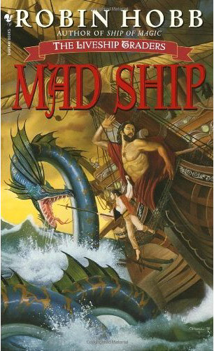
And now for exhibit A, the original American cover of Robin Hobb’s Mad Ship (1998):
Would you like a little homoerotic with that rearing sea serpent and straining, tufty-chested figurehead? Oh wait, the person hanging off of his rigging is actually a woman. She seems to be a good hand with that phallic I mean boathook though – plunge it straight into the pink, fleshy folds between Nessie’s lips, that’s it.
Okay, so maybe it’s not that bad, at least not in that way, and I’m just betraying my own interpretive proclivities – but there is something inherently hilarious about Mr. Figurehead’s stiffly horrified pose. It seems more along the lines of “OH my god I just walked in on my roommate playing Wii Fit in the buff” than “OH my god mortal peril.”
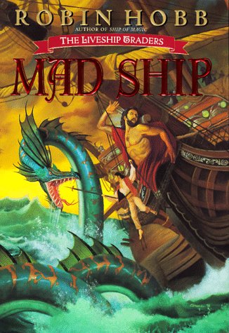
This is the kind of overly literal epic fantasy book cover that I always end up trying to hide with my palm as I read. (And I have, in fact, been reading this series, so… one day soon, it’s going to come to this.) This is also one of those covers that, in the mysterious way of fantasy reprints, ends up becoming progressively tackier and more lurid. Second edition:
It’s like it took a whole step… back. Into the 70’s. Hmm. Extra kudos on the embossed metallic font.
– E
Go to:


L.O.L.
God. I loved that second edition touch. Also, I can’t wrap my head around the proportions… that hanging guy seems just way too small.
Oh my word. I…that’s…
I’m speechless.
Kakaner – For some reason, all of Hobb’s mass-markets underwent second-edition tackification. it’s like they (the design gods) said to themselves, “How could we possibly make this ANY MORE EXCITING than it already is? …I KNOW. Make it radioactive mustard yellow. Yessssss.”
Maureen, I’m glad you’re feeling the love too.
My inner art-snob is FROTHING at the mouth. This is all your fault.
I nominate anything Robert Jordan for the next chapter.
So many years of my life spent reading the Wheel of Time that I will never get back.
there’s too much going on! some subtlety please. haven’t they heard of the magical ratio? if i remember right it’s 70/30. this is more like 95/5
Anda – My inner art-snob makes frequent visits to the outside, so you’re in good company.
So I actually am quite fond of the early Wheel of Time cover art, although I never read the series – my dad has been trying to finish The Eye of the World for years and years and years, so I grew being fascinated by the cover of that one in particular. but yeeeah, that would be why huge epic fantasy series terrify me – so life-consuming.
Anyway, I looked up the cover art of some of the later books per your request, and there are certainly some… interesting specimens to be had.
kim – LOL. Well said. Although I think 95 might be a little generous…