Reviewer: Emera
Date read: 11.18.2012
Book from: Library. Lovecraft’s works are also available online in various archives, such as hplovecraft.com.
Last Halloween I realized I hadn’t really read any Lovecraft since high school, and set out to rectify that by picking up a couple collections from the library.
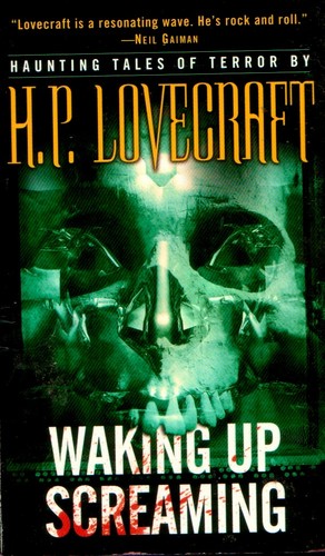
This one had a cover that I would class as “moderately metal” –

– and contained the following stories: Cool Air, The Hound, The Lurking Fear, The Terrible Old Man, The Unnamable, Beyond the Wall of Sleep, The Shadow Over Innsmouth, The White Ship, The Outsider, Herbert West – Reanimator, Arthur Jermyn, The Moon-Bog, The Temple, Dagon, From Beyond, and The Case of Charles Dexter Ward.
Assorted thoughts on some of those:
- “The Hound” – Lovecraft scholar S. T. Joshi suggests that Lovecraft deliberately, (self-)parodically overheated the language in this Gothickest of Gothic tales, wherein two Decadents struck by “devastating ennui” stray from Baudelaire and Huysmans, and into the accursed pages of the Necronomicon. Unsurprisingly, it’s long been one of my favorites. It’s so ripely morbid and hysteria-stricken. I also have a fondness for doggish ghouls, and the one summoned in this story is pretty kingly.
(Poppy Z. Brite/Billy Martin, who provided a brief foreword for this collection, turned up the decadence of “The Hound” another couple of notches in his amply homoerotic Louisana Gothic retelling “His Mouth Will Taste of Wormwood,” which I remember reading with fierce delight in high school.)
- “The Lurking Fear” boasted by far the best and most B-movie-worthy back-of-cover blurb for this collection – “An upstate New York clan degenerates into thunder-crazed mole like creatures with a taste for human flesh[!!!!!!!!!!!!]” – as well as, I think, the highest concentration of of delightfully absurd Lovecraftiness. Behold:
“With what manner of far-reaching tentacles did it prey?”
…
“Then, as I playfully shook him and turned him around, I felt the strangling tendrils of a cancerous horror whose roots reached into illimitable pasts and fathomless abysms of the night that broods beyond time.”
…
“But that fright was so mixed with wonder and alluring grotesqueness, that it was almost a pleasant sensation. Sometimes, in the throes of a nightmare when unseen powers whirl one over the roofs of strange dead cities toward the grinning chasm of Nis, it is a relief and even a delight to shriek wildly and throw oneself voluntarily along with the hideous vortex of dream-doom into whatever bottomless gulf may yawn.”
Abysms!!! Dream-doom!!!!!! That Thing about the Gryphons, too, hails from these parts.
- “The Terrible Old Man” is a fable about the triumph of xenophobia. Hooray! It’s funny that Lovecraft attributes the same kind of thuggish, bestial degeneracy to non-WASP immigrants as he does to the ancient-monster-interbred New Englanders in “The Shadow Over Innsmouth,” and to miscegenators in general (see also “Arthur Jermyn”). One imagines his ideal man as a skinny white fellow valiantly sandwiched between the forces of ancient evil and the rising, filthy tide of new immigrants. The taste of his neuroses – the smell of sheer fearfulness – is frequently almost overwhelming.
- “The Unnamable” is striking in that Lovecraft seems to be having a conversation with some of his literary detractors in it, yet turns it into an earnest philosophical assertion rather than simply a cheeky comeback, as I’d initially assumed it might be. (Though there is an element of wishfully vengeful thinking to it, too, in the tradition of Poe.)
The narrator is an obvious stand-in for Lovecraft himself, and debates with a friend who “object[ed] to my preoccupation with the mystical and the unexplained; for although believing in the supernatural much more fully than I, he would not admit that it is sufficiently commonplace for literary treatment. … With him all things and feelings had fixed dimensions, properties, causes, and effects; and although he vaguely knew that the mind sometimes holds visions and sensations of far less geometrical, classifiable, and workable nature, he believed himself justified in drawing an arbitrary line and ruling out of court all that cannot be experienced and understood by the average citizen. Besides, he was almost sure that nothing can be really ‘unnamable’. It didn’t sound sensible to him.”
Of course, matters pan out such that the skeptical friend, too, is forced into a sense of cosmic and epistemological abjection. A lot of my thinking about life, the universe, and everything Unnamable has, in fact, been flavored by Lovecraftian cosmicism in the past few years – mostly instigated by Caitlín Kiernan‘s science fiction – so I was inclined to offer plauditory fingersnaps at the end of it.
Go to:
H. P. Lovecraft: bio and works reviewed


