We steel our fluffy hearts…

…and sail in hunt of Moby Peep.

Get your Deckard on: Youtube user Crysknife007 (of course) provides days’ worth of ambient loops from the Blade Runner soundtrack.

Consider recommendations for New York Times Okay-Sellers and others from the Book List of Book Lists.

“Inside the New York Public Library is a little red train that delivers books.” Really! And some excellent book-sorting porn, too.


– E

Frazetter

Two posts on book covers I’ve enjoyed recently over at sff art blog Muddy Colors:

Related reading:
Undercover: Pretty Monsters

Undercover: Clariel

The long-dormant Undercover series features the design quirks hidden under hardcover books’ dust jackets.

Kakaner and I have both been binge-re-reading Garth Nix’s Old Kingdom series, building up to an attack on the two latest: the extra-dark prequel Clariel (which neither of us had just read), and the just-released sequel Goldenhand.

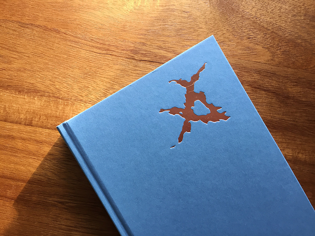
While I really, really do not like the over-the-top, video-gamey new hardcover designs, removal reveals a metallic Charter mark (the symbolic basis of the Old Kingdom’s magical system):

book-clariel-undercover-1 book-clariel-undercover-2

Satisfactorily magical!

To resume griping: I know illustrative covers are out of fashion, but as an American reader, the switch to covers that scream “I WAS DIGITALLY RENDERED” feels particularly disruptive because the original American editions of the Old Kingdom books were beautifully designed and had such a coherent visual identity, built off of Leo and Diane Dillon’s elegant, grim, chilly illustrations (see middle row here). I bought Sabriel purely because of the cover art – I was quite young, and hadn’t ever seen anything quite like it before, inhabiting the borderlands between fantasy and horror as it did. It took me an oddly long time to actually read the book after buying it, but in the intervening years I would still pick up the book just to wonder at it – Sabriel’s severe gaze and ceremonial gesture, her mysterious bells, Kerrigor’s slitted grin.

I wish we had gotten the chance to see the Dillons illustrate Clariel. In the meantime, her hardcover and Goldenhand will be running around my house naked, as it were.

Go to:

Undercover: Pretty Monsters

Spruced-up covers for Dahl and more

Charming Baker’s new covers for Roald Dahl’s short fiction

First of all, why is my name not Charming Baker? Secondly, these are really elegant and disturbing. (The Cruelty cover makes me wonderfully uncomfortable.) I do feel that Dahl’s adult fiction still has a decided cartoon or slapstick element that is not so elegant as these, but of course the elegance works against the perception that Dahl is just for kids.

Fond flashbacks now to Kakaner lending me her giant hardback Dahl short fiction collection in high school…

Iconic book covers + subtle animations by Javier Jansen

Quiet magic. I think this is so wonderfully proximal to the quiet stirring of excitement that one feels upon seeing a favorite book cover.

Both of the above links sent my way by friend C.; thank you!

– E

Mieville & Grossman, glossed; The Making of a Cover

Annotations are fun. Here are some handy collections thereof, featuring…

—–

If you love behind-the-scenes stuff, are weirdly interested in marketing, and/or fixate on cover art decisions for sff novels, check out creative director Lauren Panepinto’s wonderfully in-depth series (13 posts!) on the making of covers for a recent epic fantasy novel trilogy. The series goes all the way from casting of a martial artist as the photographic model, to prop and costume acquisition, to multiple rounds of retouching and graphic design.

So much chewy procedural and decision-making detail in there. It’s also a fun insight into what being creative director for a major sff imprint actually entails – being hyperaware of aesthetic and stylistic trends in current sff media, for example.

Panepinto also shares great advice for commercial sff illustrators over at the Muddy Colors art blog, which is where I first found her Orbit cover series.

Go to:
China Miéville: bio and works reviewed

Pay a call to Bertha Mason; dine with Alice, Gregor Samsa, or Nick Carraway

The secret attic that inspired Charlotte Brontë’s vision of the madwoman in the attic is now open for visits in Yorkshire. The real Thornfield, it turns out, is the manor of Norton Conyers, which dates to the Middle Ages; its present architecture is mid-18th-century.

Brontë paid a visit in 1839 – 8 years prior to the publication of Jane Eyre – and there heard about the 18th-century “Mad Mary” who had purportedly been imprisoned in one of the attic rooms, accessible by a hidden stair…

—–

For anyone who’s ever lingered over a particularly vivid description of food in a book: Dinah Fried’s photobook Fictitious Dishes features meticulously styled and photographed recreations of notable fictional meals. You can see photo selections and some background on the creation of the project here at Brain Pickings. (And then, if you’re feeling like cooking something up yourself, check out Kakaner’s collection of loving and lavish book-inspired recipes, Booklish!)

I actually laughed at the first photo featured at Brain Pickings because I had just the day before re-read the bit with the crab salad food-poisoning crisis in The Bell Jar: “There is nothing like puking with somebody to make you into old friends…”

There’s also something quite perverse about the bright lighting and colorful bits of produce in Gregor Samsa’s meal.

– E

A story in twelve pictures; tributes to Miéville

Fans of Australian author-illustrator Shaun Tan, please to enjoy his very short illustrated story “Eric (presented by the Guardian), about a peculiar foreign exchange student. (Fans of Chris Van Allsburg will likely be keen on Tan’s work as well, given the resonance between their quiet, eerie, carefully rendered illustrations.) The last image made me gasp, and my skin prickle.

—–

Dispatches from a Troubled City (via Super Punch) is a satisfyingly varied collection of art inspired by the work of China Miéville, featuring work by nearly 20 different artists. The collection encompasses sculpture, artifacts, poster/cover design, and illustration, all almost entirely based on the Bas-Lag books, but with a couple of tributes to Un Lun Dun (my review; Kakaner’s) as well.

Favorites: Steve Thomas’ pro-avanc propaganda, Jason Chalker’s awkward-creepy-cute magus fin, and Jared Axelrod’s box of battered memorabilia from the pages of Perdido Street Station.

Go to:

China Miéville: bio and works reviewed

Landscapes lorn and lonely

I did not know this: Tove Jansson (moomin-creator) did illustrations for the 1962 Swedish edition of The Hobbit (courtesy Babel Hobbits, a repository for international Hobbit illustrations). They range from Quentin Blake-ishly sketched storm giants, to what is now my favorite rendering of the depths of Mirkwood. I don’t understand how Jansson always manages to combine qualities of both warmth and chill in her art.

Also, her Gollum is something else – towering over Bilbo, he looks unexpectedly like a wodwo or a Green Man, though I can’t think what his wreath might be made of. (Dried bats?)

——-

Via the ever-loyal but outrageously busy Kakaner: carved book landscapes by Guy Laramee. Mute, contemplative, eerily lit. I’ve seen my fair share of altered-book art, but as Kakaner put it, “This gives me the shivers in a good and bad way. More bad though.” (But bad in a good way, I would add!)

– E

Fancy; battered

Sighted in September by Boing Boing, for particularly avid Bradbury fans: a very rare asbestos-bound 1953 special edition of Fahrenheit 451, somewhat worse for the wear, but, one hopes, still somewhat safer from incendiaries, conflagrations, merry bonfires, unmerry bonfires, and other forms of fiery doom.

—–

On display by the Uppsala University Library: a 14th-century German book that was mended with silk thread. Looking at this gives me interestingly weird feelings: up close, the stitches are so homey in appearance (good ol’ blanket stitch!), but – especially where they were used to mend holes – simultaneously resemble biological structures or growths. Plant cross-sections, vacuoles, paramecia. I can see this being used as a springboard for an art exhibit about how we think about categories of craft/art/literature, about objectness, etc. For some reason I also just want to see an art installation of a roomful of colorful books suspended from floor to ceiling in white crocheted webbing. “Shelob Reads to Excess”?

– E

Litography

A fun gift idea for typography nerds, book nerds, or both: Litography sculpts the entire text of a classic book or drama into a single, soothingly graphical image. Check out their catalogue for posters of The Origin of Species, The Last Unicorn, Just So Stories… Below are two designs that I particularly enjoyed – 20,000 Leagues Under the Sea and Dracula:

– E